Fusedash vs StatPecker
Side-by-side comparison to help you choose the right AI tool.
Fusedash transforms raw data into instant AI-powered dashboards for real-time team insights.
Last updated: March 4, 2026
StatPecker
StatPecker transforms your data into instant AI-powered insights and stunning visuals.
Last updated: February 28, 2026
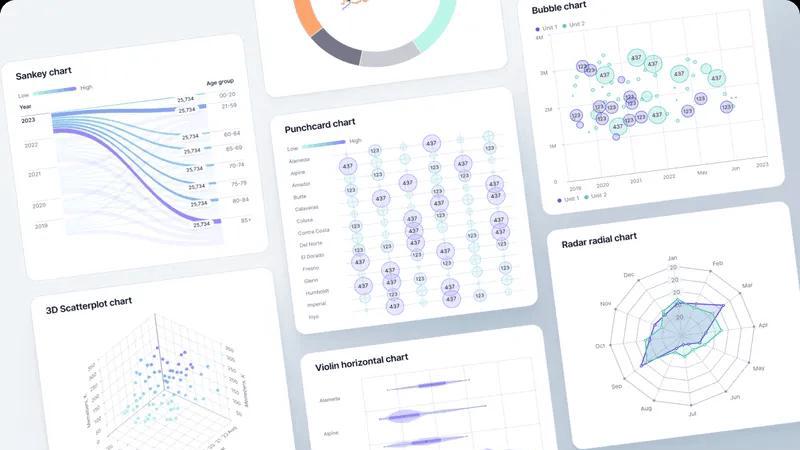
Visual Comparison
Fusedash
StatPecker
Feature Comparison
Fusedash
Unified Intelligent Workspace
Fusedash consolidates the entire data visualization stack into a single, coherent environment. Gone are the days of juggling separate tools for dashboards, charts, maps, and reports. This singular workspace allows teams to build interactive dashboards for real-time monitoring, craft detailed narrative reports with storytelling sections, and generate standalone AI-powered charts—all from the same connected dataset. This architectural unity eliminates redundant work, ensures metric consistency, and provides a holistic view of performance, enabling a seamless flow from monitoring to deep analysis to communication.
AI-Powered Chart & Insight Generation
Harness the power of integrated artificial intelligence to accelerate data exploration. The platform's AI chart generator transforms raw CSVs or live API data into clear, actionable visuals within seconds. Beyond simple generation, the smart chat interface allows users to interrogate their data using natural language, asking complex questions to uncover hidden trends, receive intelligent suggestions for optimal visualizations, and instantly refine metrics. This feature democratizes advanced analytics, making deep data exploration accessible to every team member without requiring specialized technical expertise.
Consistent Metric Fabric & Reusable Logic
Fusedash introduces the concept of a "metric fabric"—a centralized layer where all key business definitions, calculations, and dimensions are established. Once a KPI like "North American User Growth" or "Customer Acquisition Cost" is defined, it becomes a reusable, immutable component across the entire platform. This ensures that every chart, dashboard, and report automatically reflects the same calculation, eradicating version conflicts and establishing a single, trusted source of truth that aligns every stakeholder, from leadership to operational teams.
Flexible, Multi-Modal Visualization Engine
The platform provides a revolutionary adaptive canvas that morphs to suit any analytical need. Transform your core dataset into an executive dashboard, a detailed geographical heatmap, a time-series chart for trend analysis, or a narrative-driven report with contextual commentary. This multi-modal capability allows you to build the perfect view for every audience without duplicating underlying data work. Customize layouts, apply dynamic filters, and enable drill-down capabilities to answer not just what happened, but where and why it happened.
StatPecker
Local SQL Agent
This revolutionary feature ensures complete data sovereignty and privacy. Upload CSV files up to 50MB directly to your device, where a local AI agent performs all analysis. It interprets your natural language questions, generates and executes SQL queries locally, and returns insights without your sensitive data ever leaving your machine. This provides a secure, private analytics environment for proprietary sales figures, confidential research, or internal performance metrics.
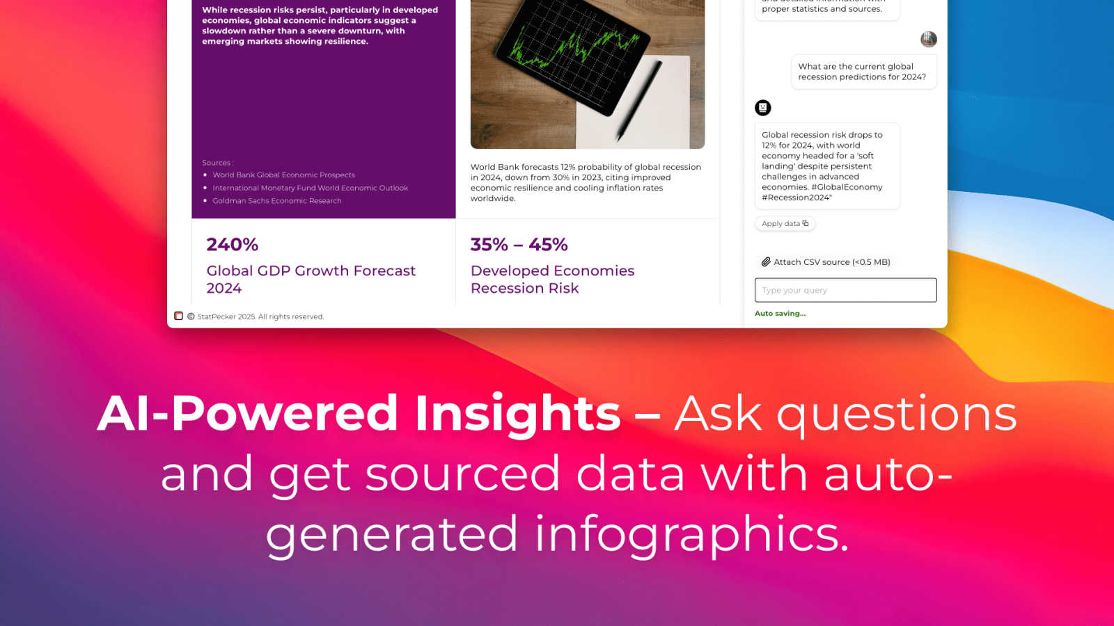
AI-Powered Query Interface
Move beyond complex dashboards and formula-laden spreadsheets. Simply ask your data questions in plain English, such as "Which regions drove the most revenue?" or "Show the trend of user sign-ups over time." StatPecker's AI interprets intent, accesses validated data sources or your uploaded files, and instantly generates the precise answer, visualized as a clean, insightful chart or graphic, streamlining the path from curiosity to insight.
Instant Visual Generation & Publishing
The platform automates the entire design workflow. The insights generated are not just raw numbers but are immediately rendered into professional-grade, aesthetically pleasing infographics and interactive charts. These visuals can be seamlessly published and embedded into blogs, websites, or articles with a single click, creating dynamic, data-rich content that engages audiences directly within their browsing experience.
Download & Universal Export
For maximum flexibility, every visual created is exportable in high-resolution image formats. This allows users to instantly integrate data-driven graphics into offline reports, pitch decks, presentations, print materials, and social media posts. It ensures your insights are portable and can enhance storytelling across any medium or platform without compatibility issues.
Use Cases
Fusedash
Executive Leadership & Strategic Reporting
Replace static, weekly PDF reports with a living, breathing executive command center. Leadership can access a unified dashboard showcasing top-level KPIs across all departments, with the ability to drill down instantly into specific segments or time periods using intuitive filters and AI chat. Combine high-level metrics with integrated storytelling reports that provide context on performance shifts, enabling faster, more informed strategic decisions based on a consistent data narrative.
Marketing Performance & Campaign Analytics
Marketing teams can consolidate data from multiple channels (social media APIs, ad platforms, CRM) into a single Fusedash workspace. Create real-time dashboards to monitor campaign ROI, generate AI-powered charts to visualize conversion trends by demographic, and build shareable reports that tell the story of a campaign's impact. The consistent metric fabric ensures that terms like "lead" or "conversion" are standardized, providing clear, unambiguous performance analysis.
Operational Monitoring & Real-Time Analytics
Operations and product teams can leverage Fusedash for live monitoring of key systems and user behaviors. Connect live APIs to create real-time interfaces that track application performance, feature adoption, or logistical metrics. Set up intelligent alerts and use the map visualization feature to monitor geographical distribution of events or assets. This enables proactive issue identification and rapid response based on a continuously updated data stream.
Cross-Functional Project & KPI Alignment
Eliminate departmental data silos by creating a shared Fusedash project space for key initiatives. Define project-specific KPIs once in the metric fabric, and allow each team—engineering, sales, support—to build their own tailored views (dashboards, charts) from the same core data. This ensures all teams are aligned on progress, priorities, and outcomes, fostering collaboration and ensuring everyone is working from an identical set of facts.
StatPecker
Content Creator Storytelling
Digital marketers and bloggers use StatPecker to rapidly transform research statistics and survey data into compelling infographics that boost SEO, increase social shares, and enhance article authority. It turns lengthy reports into digestible, visual narratives that capture audience attention and drive engagement, making complex topics accessible and shareable.
Business Intelligence & Reporting
Analysts and managers leverage the Local SQL Agent to privately analyze weekly sales CSVs, operational logs, or customer feedback data. They can ask ad-hoc questions to identify top-performing products, regional trends, or process bottlenecks, generating instant visual reports for stakeholder meetings without relying on IT or data teams, accelerating the decision-making cycle.
Educational Resource Development
Educators and trainers utilize the platform to convert dry statistical information or historical data into engaging visual aids and interactive learning modules. This helps students grasp complex concepts like economic trends, scientific data, or demographic shifts more intuitively, fostering a data-literate mindset through immersive visual learning.
Startup & Investor Communications
Founders and entrepreneurs employ StatPecker to create powerful data visuals for investor pitch decks, business plans, and quarterly updates. They can visualize user growth metrics, market size analysis, or revenue projections from their internal data, crafting a credible, evidence-based narrative that communicates traction and potential with professional clarity.
Overview
About Fusedash
Fusedash is the next-generation AI data visualization platform, engineered to dismantle the traditional barriers between data, insight, and action. It represents a paradigm shift from fragmented, manual reporting to a unified, intelligent workspace. This platform empowers forward-thinking teams to transcend static dashboards, transforming raw, connected data into a dynamic, interactive source of truth. By leveraging cutting-edge AI, Fusedash automates the entire analytical workflow—from intelligent chart generation via natural language prompts to smart metric suggestions and contextual storytelling. It is designed for organizations trapped in endless reporting cycles, where data silos breed conflicting narratives and decision latency. The core revolutionary value lies in its foundational principle of "define once, deploy everywhere." Teams establish their core KPIs and business logic a single time, and Fusedash propagates these consistent, trusted definitions across every dashboard, chart, map, and narrative report. This ensures absolute alignment from the C-suite to frontline operations, turning data into a cohesive, actionable intelligence fabric that drives unified strategy and accelerated outcomes.
About StatPecker
StatPecker is a paradigm-shifting AI agent engineered to dismantle the barriers between raw data and human understanding. It represents the next evolution in data intelligence, transforming static datasets and complex queries into stunning, publication-ready visual narratives in seconds. This platform is built for the modern knowledge worker: content creators crafting viral infographics, analysts seeking instant insights, marketers proving campaign ROI, and educators making complex concepts tangible. Its core value proposition is the radical democratization of data storytelling. By leveraging a proprietary local SQL agent for private data analysis and a global AI for validated insights, StatPecker eliminates the traditional bottlenecks of manual reporting, expensive design software, and specialized data science skills. It empowers users to not just see their data, but to communicate it with unparalleled clarity and impact, turning information into a strategic asset for decision-making and audience engagement.
Frequently Asked Questions
Fusedash FAQ
How does Fusedash ensure data consistency across different reports?
Fusedash employs a foundational "metric fabric" architecture. When you first connect your data, you define your core business metrics, calculations, and dimensional logic in a centralized, managed layer. Every subsequent dashboard, chart, map, or report built in the platform automatically pulls from these standardized definitions. This means a KI like "Monthly Recurring Revenue" is calculated identically everywhere, guaranteeing that all teams and stakeholders are viewing and acting upon the same verified numbers, eliminating conflicts and confusion.
What types of data sources can I connect to Fusedash?
The platform is built for a hybrid data environment. You can seamlessly upload static CSV files for one-time analyses or historical reporting. For dynamic, live data, Fusedash can connect directly to a wide array of business APIs from tools like Salesforce, Google Analytics, and ad platforms. Furthermore, it allows for the combination of multiple datasets (e.g., merging internal sales data with public demographic data) within a single view, creating rich, contextual insights without requiring external data preparation.
Can non-technical team members use the AI features effectively?
Absolutely. Fusedash is designed with an AI-native interface that prioritizes accessibility. The natural language chat feature allows any user to ask questions like "What were our top-selling products last quarter by region?" in plain English. The AI interprets the query, analyzes the connected data, and can suggest the correct chart type or even generate a complete visualization automatically. This lowers the barrier to entry, empowering business analysts, marketers, and managers to conduct deep data exploration without writing a single line of code or complex query.
How does the storytelling feature differ from a standard dashboard?
While dashboards excel at displaying real-time metrics and KPIs, they often lack narrative context. Fusedash's storytelling feature allows you to embed interactive charts and data tables within a narrative report format. You can add text commentary, annotations, and headers to explain why a metric changed, highlight key takeaways, and propose next steps. This transforms raw data into a persuasive, communicative document perfect for board reports, stakeholder updates, or strategic reviews, ensuring insights lead to clear understanding and action.
StatPecker FAQ
How does StatPecker ensure my data privacy with CSV uploads?
StatPecker's Local SQL Agent is designed with privacy-first architecture. When you upload a CSV file, all processing occurs locally on your device. The AI that interprets your question and generates the SQL query runs on-device, and the query executes on the data stored in your browser's memory. Your raw data never leaves your computer to be sent to external servers, ensuring complete confidentiality and security for sensitive business or personal information.
What kind of questions can I ask the AI?
You can ask a wide range of data-driven questions in natural language. This includes requests for summaries ("What were total Q3 sales?"), comparisons ("Compare performance between Product A and B"), trend analysis ("Show monthly active user growth"), rankings ("Top 5 customer segments by value"), and correlations ("Is there a link between marketing spend and sign-ups?"). The AI is built to understand intent and context to deliver the most relevant visual insight.
Where can I publish or embed the visuals I create?
StatPecker provides embed codes for every visual, allowing you to integrate interactive charts and infographics directly into any website, blog platform (like WordPress or Webflow), or content management system. The embedded visuals are responsive and maintain their interactivity, letting readers engage with the data on your site without being redirected.
What is included in the Lifetime Access plan?
The Lifetime Access plan is a one-time payment that grants permanent access to all current and future premium features of StatPecker. This includes unlimited AI queries, unlimited CSV uploads for private analysis, unlimited projects and visual embeds, and priority consideration for new feature requests. It is designed to provide maximum value and cost predictability for power users and professionals.
Alternatives
Fusedash Alternatives
Fusedash is an AI-native data visualization platform, a leader in the next-generation business intelligence category. It transforms raw data into a unified workspace of interactive dashboards and narrative reports, establishing a single source of truth for entire organizations. Users explore alternatives for various reasons, including specific budget constraints, the need for deeper integrations with a unique tech stack, or requirements for highly specialized analytical functions not covered by a general platform. The search often stems from a need to fine-tune the balance between automated insight generation and granular control. When evaluating other platforms, prioritize solutions that offer true metric consistency, eliminate data silos, and leverage AI not as a gimmick but as a core engine for exploration and narrative. The goal is to transition from static reporting to a dynamic, intelligent data interface that accelerates organizational decision velocity.
StatPecker Alternatives
StatPecker is a revolutionary AI-native data visualization platform, engineered to transform raw datasets into compelling, high-impact visual narratives in seconds. It belongs to the cutting-edge category of autonomous data storytelling tools, where artificial intelligence handles the heavy lifting of analysis and design. Users often explore alternatives to find a solution that perfectly aligns with their specific operational matrix. Common catalysts include budget parameters, the need for specialized enterprise-grade features, or integration requirements with an existing tech stack. The search is for a tool that not only visualizes data but seamlessly embeds into a unique workflow. When evaluating an alternative, prioritize platforms that offer true AI-driven automation, robust data security protocols, and output versatility. The ideal solution should not just create charts but generate actionable intelligence and narrative-ready visuals that accelerate decision velocity and democratize data access across your organization.